
| Signs and lettering of the company | ||||
| Year | Information | |||
| 1946-1964 | 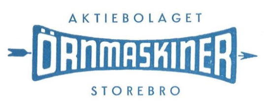 | Ivar Gustafsson already used this logo when the company only produced mechanical products (lathes). The logo varied only slightly in terms of the typeface used for the words above and below the core logo. | ||
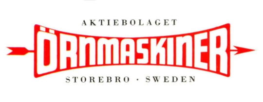 | The font was either sans serif or serif. Depending on whether the documents were intended for export, the addition "SWEDEN" was added to the "STOREBRO" in the lower area. | |||
| 1964-1988 |  | After the takeover of Storebro Bruks AB, the company Örnmaskiner took over the name of its better-known former competitor in 1964. The lettering was in capital letters. | ||
| 1964-1972 | 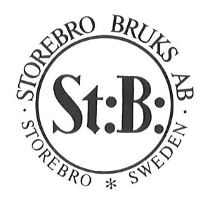 | In addition to the pure lettering "STOREBRO BRUKS AKTIEBOLAG", a seal-like logo designed by Dick Gustafsson was also used as a supplement in the meantime. | ||
| 1972- |  | After the seal logo was dropped, the lettering "STOREBRO" was increasingly used as an identification mark. After initially being used in different sans-serif typefaces, it was used as a trademark in the typical serif typeface from 1972 onwards. | ||
| 1988- |  | After the boatbuilding business was spun off into a separate company, the long "STOREBRO BRUKS AKTIEBOLAG" lettering was simply changed to "AB STOREBRO ROYAL CRUISER". The appearance remained the same, so most people did not even notice this change. | ||
| 1991-1993 |  | From 1991, a new logo was designed based on the product name "STOREBRO ROYAL CRUISER". The previous "STOREBRO" lettering was combined with the term "Royal Cruiser". For the latter, the font was used that had already been used in brochures for the type designation since 1981. The logo was adorned with a crown. | ||
| 1993-1999 |  | In 1993, the logo introduced two years earlier had to be modified. The crown used so far was reserved for the Swedish Royal House. The shipyard had been reported to the Royal House for using the symbol. Therefore, a modified crown was used from 1993 onwards. | ||
| 1999- |  | In 1999, a very radical cut was made. After the name "Royal Cruiser" had characterised the brand for about 30 years, it was now completely abandoned and replaced by "STOREBRO - TRUE SCANDINAVIAN". The royal claim was underpinned only by the crown taken over from the old logo. | ||
| Signs and lettering on the ships | ||||
| Year | Information | |||
| 1979- | 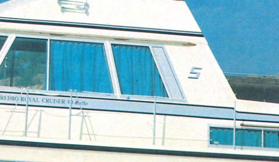 | If one disregards the type plates used so far, a simple "S" was introduced as the first logo on the Storebro Royal Cruiser 40. At first, the same "S", sloping to the right in italics, was used as a silver sticker for port and starboard. This "S" then looked somewhat incongruous on the port side. Interestingly, this logo was only used for the Storebro Royal Cruiser 40 and later for the SRC 340. The "S" was not adopted for the Storebro Royal Cruiser 31, Storebro Royal Cruiser 34 and Storebro Royal Cruiser 36, which were produced in parallel. | ||
| -1987 | 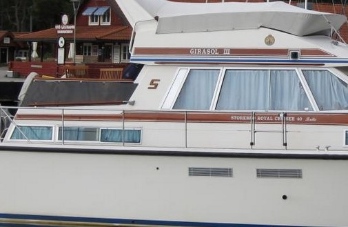 | With the change from silver glued-on trim to wooden trim, the "S" was also made in wood. At the same time, the somewhat unfortunate port "S" was tilted to the left in the direction of travel. | ||
| 1987-2000 | 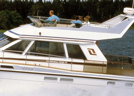 | With the presentation of the SRC 470, a new logo was also presented. This consisted of two wooden parts with a stylised "S" in the middle. The logo was produced to match the port and starboard sides. This logo was also adopted for the SRC 340, which had been produced with the old "S" until then, as well as for all later models. A small peculiarity was the fact that the original Storebro parts were mislabelled and BB and STB were interchanged. This led some owners to mount the logos upside down, so that the logo is wider at the top than at the bottom. | ||
| 2000- | A new logo was created for SGS 62 in 2000. This consisted of a metal ring with a red filling and the crown used in the company logo. | |||
| 2001-2011 | 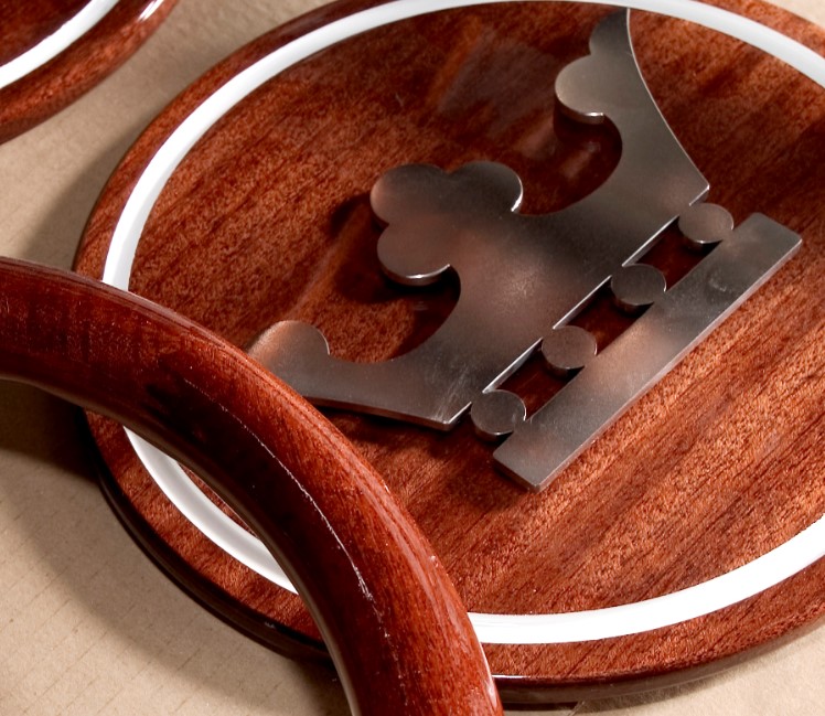 | With the change to "True Scandinavian", a new logo was introduced for the SRC 515 instead of the stylised "S". This did the splits between the logo of the SGS 62 and the previous wood-based logos. The logo consists of a wooden plate with a surrounding white band and an attached crown cut from stainless steel. Without the surrounding white band, the logo was also used for the SRC 465 and later for SRC 475. For the later SRC 410/SRC 435, the white banded version was used again. | ||
| 2011-2013 | 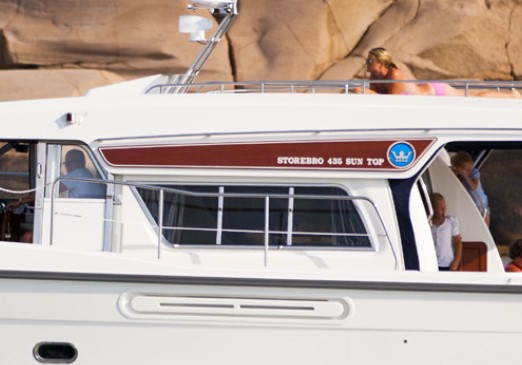 | With the presentation of the SRC 435 Suntop, a new logo variant was also introduced. This consisted of a blue circular background with an attached crown, embedded in the wooden type plate. | ||